
If you’ve ever toggled through your camera’s settings or played around in Photoshop, you’ve likely come across a histogram. At first glance, it can be ambiguous what this graph and its markings mean. As complicated as it might seem, it’s actually quite simple to understand. In this article, we will define what a histogram is and run through various situations you would need to use it. Additionally, we will walk through the steps to using a histogram and teach you how to read one to ensure the videos or photos you take look the best they possibly can.
What is a histogram?
A histogram is a graph that displays the luminance and tones of a video or image. Most commonly, histograms display the shadows and highlights of an image. However, there are other histograms that display the image’s levels of red, green, and blue tones. Most histograms are viewable on your camera. Also, most post-processing software, like Adobe Premiere Pro CC, should have a histogram. However, if you use a basic photo editor, you might not have access to one. In that case, you can use a few online sources to view basic histograms, like Photopea.
Why are histograms beneficial?
Ultimately, histograms give videographers and photographers a reliable way to review their image’s exposure. The graph shows the distribution of luminance and tones, giving you a good idea of whether your image’s exposure is good or needs adjustments. They can also help you determine if your colors are balanced.
While you can check your image’s balance through your camera’s LCD screen or through an electronic viewfinder, histograms give you a much more accurate and informative view of the image’s exposure. For instance, if your image is blown out, the graph will be skewed to the right side of the graph. One glance at the graph will tell you that your image has too much pure white and is missing mid-tones.
How to read a histogram
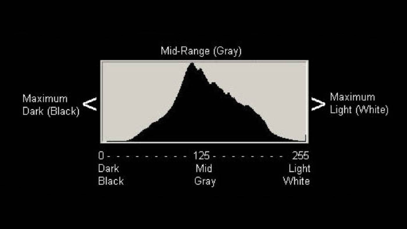
Histograms display your image’s luminance levels or colors in a particular way. In the case of blacks and whites, the graph shows the number of pure black pixels on its left side. Likewise, the graph displays pure whites on its right side. All of the intervals between the left and right sides of the scale are the image’s mid-tones. So, if you were to start on the left side of a histogram and move to the right, the scale becomes brighter.
The peaks and dips of the histogram visually communicate the image’s number of pixels in that tone. For example, if there is a large peak on the left side of the histogram, the image has a high number of dark pixels — the same works for color histograms. If there’s a higher peak on the red histogram than the blue histogram, that indicates your image more has warmer, reddish pixels.
Typically, you want to avoid having any obvious skews in your histogram. Any extreme skews in your luminance levels indicate that your image is either overexposed or underexposed. However, that isn’t always the case. Still, it’s best to keep your histogram’s peaks near the center for learning purposes. This means your image contains a lot of mid-tones and details. Ultimately, you’re looking to have a graph that looks like an upsidedown U.
Step one: take a look at your histogram’s curves
The first step to reading a histogram is to review the overall look of the graph — checking for any noticeable peaks, dips or plateaus. If you have Adobe Photoshop CC or any equivalent photo-editing software, go ahead and open the program. Once inside, you can use any image you have on hand. Open the image in the program and there should be an option to view its histogram. In the case of Adobe Photoshop, go to “Windows > Histogram.” There, you will see the image’s luminance levels and color levels. You can see how the graph changes by going to “Image>Adjustments>Levels.” Go ahead and play around with the graph and pay attention to how the curves of the histogram change when you adjust the image’s number of black and white tones.
As you will notice, the graph skews left when there are more black pixels in the image. When there are more white pixels, the graph is right-sided. A histogram with lots of mid-tones usually indicates the image is exposed correctly.
Step two: Look for clipped tones
Always look for any peaks placed right up against the histogram’s wall on either side of the scale. If there’s a peak up against the wall, there’s undoubtedly a loss of information in your image. This is what is called clipped tones. If there are any clipped tones in your image, be sure to correct them. You can do this in post-production or make adjustments to your exposure if you’re viewing the histogram on your camera. You will have to either increase or decrease your ISO to do this. For example, if you’re histogram shows clipped tones on its left side, this means the image is underexposed. You want to increase your camera’s ISO and lower the aperture.
The perfect graph isn’t always ideal for your project
It’s important to note that histograms are helpful tools for reading your image’s exposure. However, achieving a perfect histogram isn’t always desirable. Images don’t always have to have perfect exposure. Sometimes, an image calls for more lights or darks to drive home an emotion or story. For instance, in the two examples below, each has graphs skewed on the far left or right side of their histograms. However, they are exposed in such a way to convey the story. In John Carpenter’s “Halloween”, the film often hides Michael Myers in the shadows — adding to the horror and suspense of not knowing where he is. In Steven Spielberg’s “Raiders of the Lost Ark,” when Indiana Jones solves the puzzle to uncover the ark, he needs to use the sun. The film visually communicates he’s using sunlight by showing an overexposed beam of light shining down into the tomb.
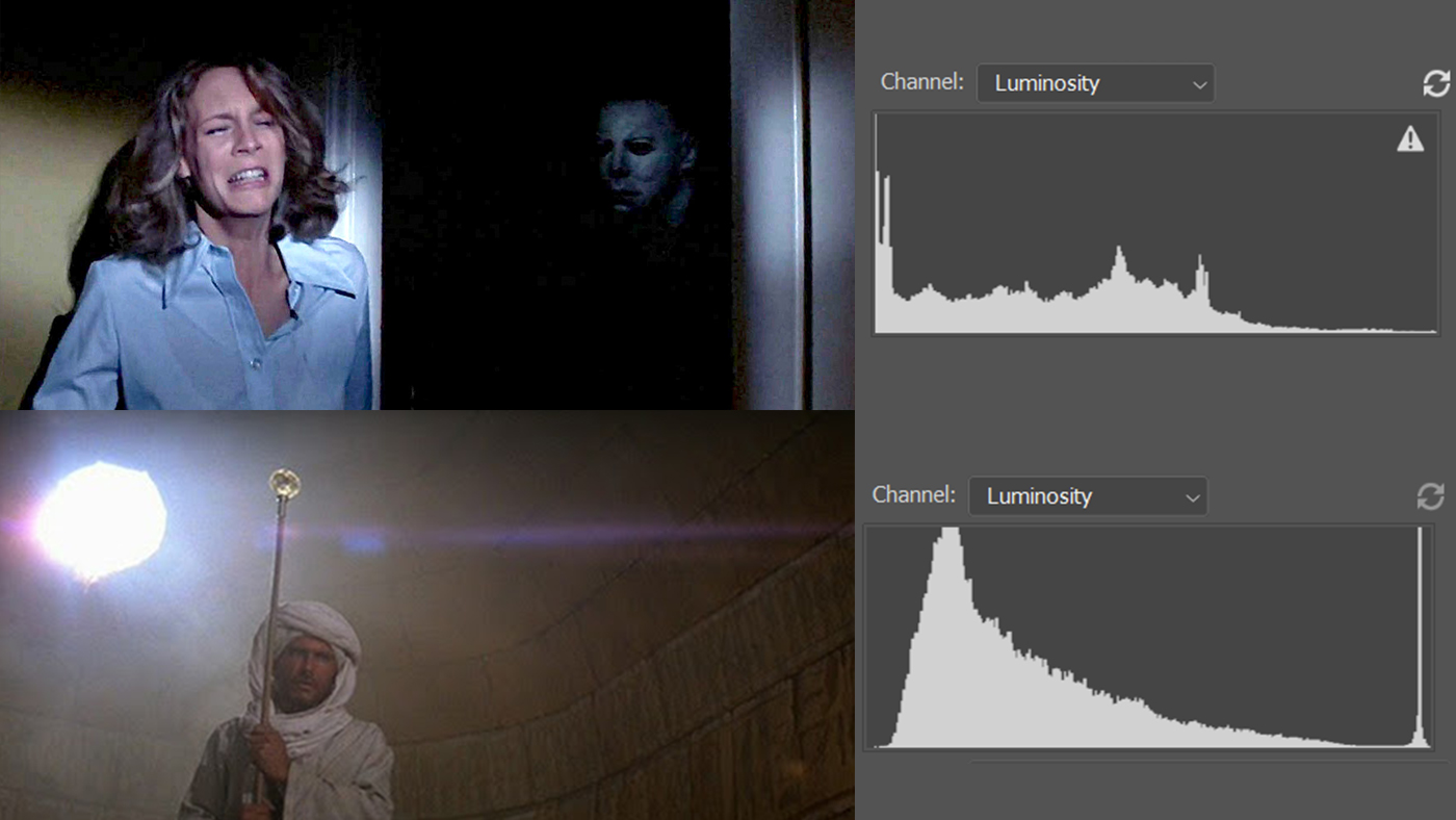
While these scenes aren’t technically exposed perfectly, they have been exposed to fulfill the creative needs of the film. What this means is that you have chosen an exposure setting to fit the story. Even if your image has a perfect histogram, that doesn’t automatically make it a good image. There are many videographers and photographers who will want to either overexpose or underexpose a shot for creative reasons. So remember, it’s important to know how to get a perfect histogram, but it’s okay to stray from this process occasionally.
Use histograms to achieve the perfect image
Whether you want to make sure you expose your image correctly or to achieve a particular effect or feeling, histograms can help. It will take some time to read a histogram accurately, so feel free to play around with different videos and images to get the hang of it. Once you learn how to use it, you’ll be a step ahead of the pack. You’ll be able to follow the rules of exposure and, as with most rules in art, break them whenever you feel it’s called for.


