
Adobe Color uses the power of Color Theory, wrapped beautifully in a succinct, easy-to-use tool that is for more than just designers.
Adobe’s Creative Cloud offers powerful tools for designers, visual artists, photographers, web pros, and us, the videomakers. What’s been interesting to watch throughout CC’s growth is the addition of tools to be used across all of the suite’s applications. One of the most useful and powerful of these tools is Adobe Color, a web application created with designers in mind.
Fortunately, designers aren’t the only ones to benefit from Color’s awesome power.
So what exactly is Adobe Color?
Adobe Color has been around for some time, under its previous name Adobe Kuler. Turns out Adobe thinks Color is cooler than Kuler and so they rebranded the service. Since the rebrand, there are plenty of new features, making it a must-have for any creative.
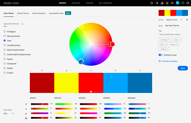
To begin with, Adobe Color is a browser-based application with an interface featuring a large color wheel. To it’s left are a handful of options that work in conjunction with the color wheel. Essentially, you will use the wheel to choose a base color for your theme and apply one of the options to achieve a theme. The list of options is called Color Harmony Rules, and they refer to color rules that exist outside of just Adobe Color. Choosing one of these rules will return additional colors that work with your base color.
The Color Harmony Rules that determine which additional colors are in your theme consist of Analogous, Monochromatic, Triad, Complementary, Split Complementary, Double Split Complementary, Square, Compound, Shades and Custom. We’ll take a closer look at what each of those means in the sidebar.
Choosing a theme
To create a theme, choose your base color. This is possible by either by dragging a selector or by directly entering a hex code value. Alternatively, you can drag RGB and brightness sliders to get exactly the color you’re looking for. Once you’re happy, it’s time to choose one of the Color Harmony Rules. This will return four other colors that relate to your base color, as dictated by the selected Color Harmony Rule.
For instance, let’s select a bright red as your base color and choose to use the “Complementary” Color Harmony Rule. The result is four colors that work in conjunction with that red. In this case, a burgundy, a lighter red, and a couple of greens. Again, check the sidebar for why these colors are returned to you. Now leave the base color the same, but change the Color Harmony Rule selection to “Shades” and you will see a handful of colors that are all shades of your base color.
The goal is to use the power of the application to create a a color scheme that makes your project visually appealing and consistent.
The secret sauce behind Adobe Color – color theory
While my colleagues before me have done a much better job of explaining color theory, let’s take a look at the basics anyways. In traditional color theory, there are three primary colors (red, yellow, blue), three secondary colors created from mixing the primary colors (green, orange, purple), and six tertiary colors, created from mixing primary and secondary colors.
For our purposes, let’s look at very basic theory as it applies to the color wheel. To start, the wheel contains all of the primary, secondary and tertiary colors, with complementary colors opposite one another.
What’s hot and what’s not?
Drawing a line through the wheel separates warm and cool colors. Generally reds, oranges and yellows are considered warm colors, while greens, blues and purples are considered cooler colors. Think of scenes in your favorite movies that are predominantly a warm red-orange, or a cool blue-green and you’ll be seeing color theory at work. Every movie uses color theory to create a feeling in a scene, but I’ll leave those examples to the experts.
There’s far more to the art and science that is color theory, but that’ll get us rolling enough to start understanding Adobe Color.
Exploring Adobe Color
Diving into Adobe Color’s interface, let’s start by taking a look at the four headings under which you will do all of your work.
Create
Within Create, you have options to plot a theme with the color wheel or extract a theme from an image or graphic. You can also extract a gradient from an image or graphic, or test your color theme for accessibility compliance. This final option is interesting and very useful, as it simulates how your theme will appear to those who are color blind. The simulations display how the theme will look to those with Deuteranopia, Protanopia, or Tritanopia. It will also show an alert if there is an issue with your theme.
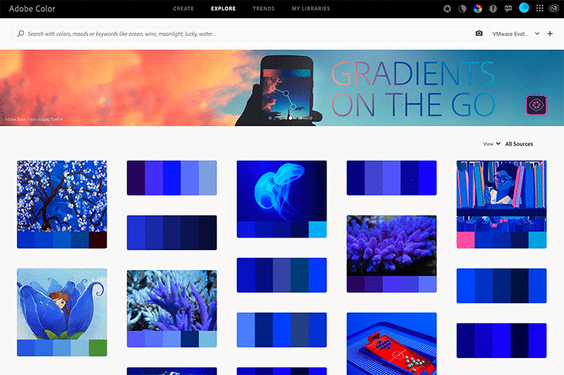
Explore
Explore is where you will be able to see imagery with associated themes and original themes created by other artists. You can use these themes as is, or you can edit them to suit your project. You can also download themes or simply acknowledge something that catches your eye by clicking “appreciate”.
Trends
Trends is where you will see real-world images and graphic examples by designers, illustrators and many others, curated from Behance and Adobe Stock. You will also see the color theme associated with their incredible work.

My Library
My Library is where your own libraries of color themes and gradients will end up. By choosing to add color themes to a library, whether you created them or simply found them in the Explore or Trends section of Adobe Color, you will have access to those themes in Premiere and After Effects (along with other Creative Cloud applications). As you create the graphical elements, you will have the exact palette you want to apply to your work.
Why do designers use Adobe Color? Why should you?
Designers use color theory and tools such as Adobe Color to aid in their work, but why? Briefly, colors convey feelings that may describe a brand or make a logo enticing.
When it comes to film and video, we use color theory for that same purpose. It can help you properly tell a story, or help a company convey a brand philosophy. Color can even help you brand your Instagram channel in a way that appeals to the senses and locks in viewers.
What do my color choices mean?
While some experimentation is necessary for any project, learning a bit about color rules can be important. For instance, consider using complementary colors, which contrast strongly with one another without clashing. This will draw attention to what’s important in your content. Other approaches, such as using an analogous or triadic color scheme could work well without being as brash as using complementary colors. Keep in mind that warm colors, such as reds, oranges and yellows, tend to exude happiness, passion, warmth and energy. While cooler blues, greens and purples can make us feel a sense of calmness or trust. It’s no mistake that many large organizations use blue logos.
Of course, you’ll need to consider your project and your audience to properly choose the right approach. This is where Adobe Color simplifies the process.
And that’s really the beauty of Adobe Color: it’s for everyone. Its very nature is one of time-saving and beautifying anything. Whether you are creating vacation videos or starting a YouTube channel, Adobe Color makes creating a color theme easy. Even setting up a new YouTube channel is better with a color palette. You can create a logo and background that work together or pull a color theme from something inspirational that you’ve seen along the way.
As a quick aside, you don’t need a computer to use Adobe Color. It works brilliantly on any device through a browser and can be bolstered by the awesome Adobe Capture application.
Conclusion
It’s our job to deliver content that’s visually pleasing, and we all have different backgrounds. Some of us went to school for design, and many of us didn’t. With learning design along the way, it can be tricky to pick up all of the theory that’s out there. Adobe Color helps us lean on the experience – and algorithms – of Adobe, and leverage the brilliance of thousands of designers from around the world. With a bit of theory and the power of Adobe Color, we can keep both hands on the color wheel.
SIDEBAR – Color harmony rules guide
Analogous – Uses colors that are adjacent on the color wheel. These colors usually blend well with one another and are generally pleasing to the eye.
Monochromatic – Uses variations in saturation and brightness of a single color. This color rule returns five colors sharing the same hue but different saturation and brightness values. Monochromatic colors work well together to create a soothing effect.
Triad – Uses colors evenly spaced around three equidistant points on the color wheel. This color rule returns two colors with the same hue but different saturation and brightness values from the first point on the color wheel, two from the second point on the color wheel, and one color from the third point. Triadic colors are contrasting, but not as contrasting as complementary colors.
Complementary – Uses colors opposite to each other on the color wheel. This color rule returns two colors with the same hue as the base color, the base color itself, and two colors with the same hue from the opposite point on the color wheel. Complementary colors provide high contrast and stand out when used together.
Split Complementary – Uses one base color and two secondary colors. Instead of using a complementary color, two colors placed symmetrically around it on the color wheel are used to get a combination of one warm and two cold colors (or vice versa).
Double Split Complementary – Consists of 2 pairs of complementary colors, forming an “X” on the color wheel.
Square – Uses four colors spaced evenly around the color circle. Square color schemes work best if you choose one color to be dominant.
Compound – Uses a blend of complementary and analogous colors. This color rule returns two colors with the same hue that are adjacent (analogous) to the base color, the base color itself, and two colors opposite to the base color (complementary) but adjacent to each other. These themes have a similar contrast to complementary color themes.
Shades – Uses five colors that share the same hue and saturation but different brightness values.
Custom – Lets you manually select the colors on the color wheel in your palette without any rules controlling them.


